
As it has been recently announced, Transnational Dialogues now sports a brand new logo. Despite its unique character and elegant style, the former logo – for which we are still very grateful to its excellent designer, Lorella Pierdicca of LLdesign – could not keep up with the recent evolution of the project, which went from being a Sino-European think-tank to a truly transnational exchange platform for art and culture. Therefore, a new logo was needed. But, as it is rather common in our approach, it came spontaneously and adventurously.
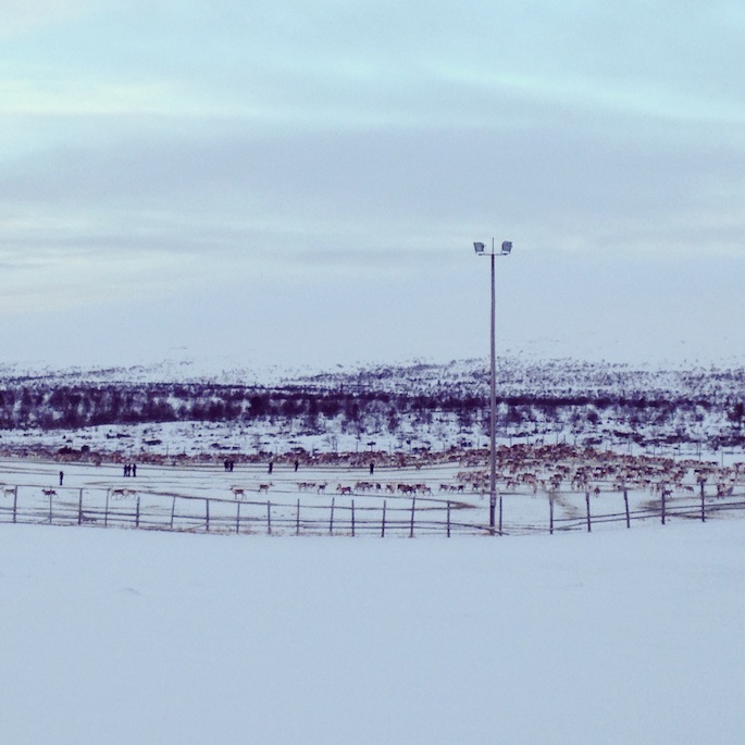
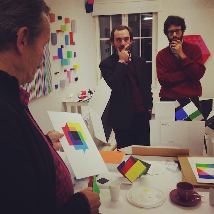
In fact, it all started on a cold, wintery afternoon in Oulu, Finland. Lorenzo and Luigi, two of the project’s coordinators, were on a research trip that brought them from the Finnish capital, Helsinki up to Kautokeino, in Norwegian Lapland. Halfway of their journey they visited the studio of artist and designer Veikko Törmänen. While browsing through his drawings, one sketch in particular caught Lorenzo’s attention.
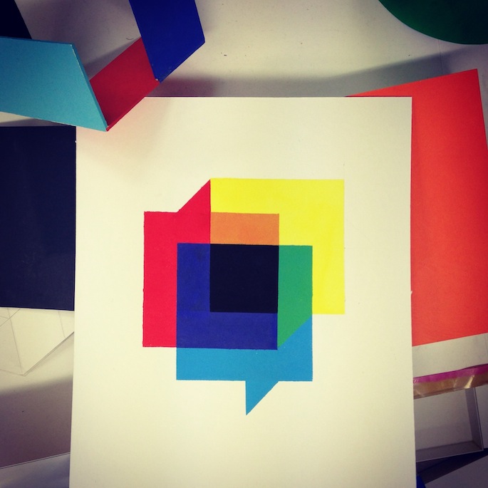
The logo is made of three, squared speech bubbles intersecting themselves. While their colours immediately remind of the three main project’s geographical areas of interest – red for China, blue for Europe and yellow for Brazil – the speech bubbles clearly refer to the dialogues (and their intersecting with each other) that the project has been carrying forward so far and will develop even more in the future.
Transnational Dialogues would like to thank Veikko Törmänen, Jaakko Mattila and Maite Coloma, who shared this fortunate and meaningful encounter together with the two project’s coordinators, Lorenzo and Luigi. Designers Andrea Montuori (Rome) and Julia Masagão (Berlin/São Paulo), whom we are also very grateful to, have then transformed the original sketch into the current logo.